Jolena Leininger
Jolena’s clients consist of young novice riders, and older riders looking for a tune up. A logo with contrasting colors and a youthful western look was put together to compliment Jolena’s fun bubbly personality and the joyful atmosphere she creates. To insure the logo as a whole stays cohesive, the horse graphic was recreated with a more painted look to complement the hand drawn font choice.
Mt Hood Equestrian Center
The re-opening of the Mt. Hood Equestrian Center in Sandy Oregon, is one that has been long awaited since it’s purchase for local equestrians. Once open, The Center was in need of dynamic and eye-catching collateral to advertise their events. While each poster consists of a different style, the horses are posed with power and energy to excite local equestrians for upcoming events.
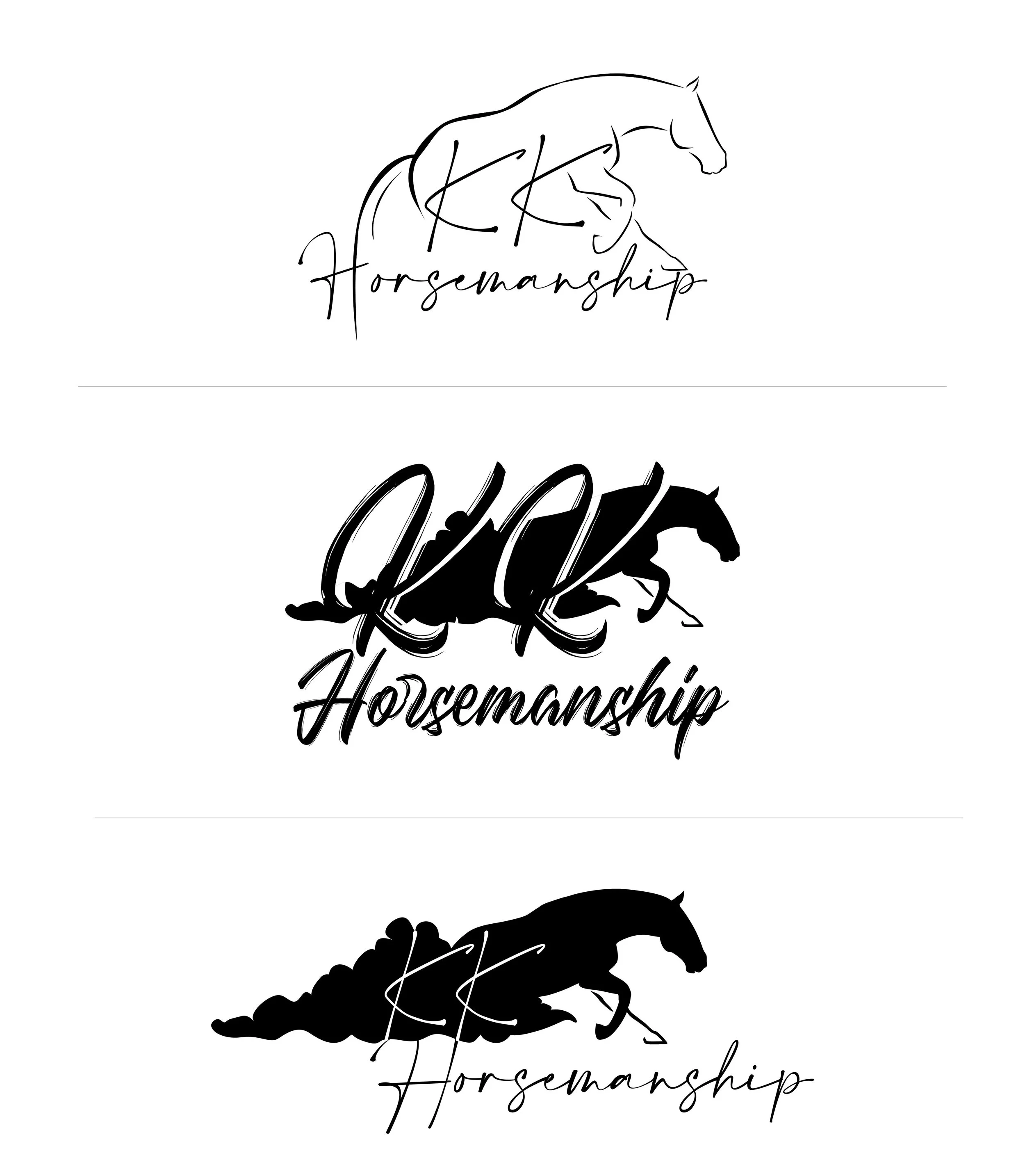
KK Horsemanship
Kara Kamers is a young, but knowledgeable talented horsewoman specializing in reining. While Kara is young, she needed a professional look for her logo to embody her brand. Her logo envelops a reining horse performing a sliding stop, which is one of the most impressive and powerful moves in a reining pattern that Kara performs. Mastering this move takes copious amounts of experience, education, and talent to master, and that are all qualities Kara possesses.
Jesse Saboe
“No hoof, no horse”, is a true statement that every farrier/trimmer knows and lives by. The trade of equine trimming and hoof care has been passed down in Jesse’s family through generations, just as her family heirloom cow skull has that hangs above her barn. Our goal was to bring a touch of family history into her logo while enveloping a familiar western charm that every customer sees when walking into Jesse’s barn.


